Your Brand’s Next Evolution.
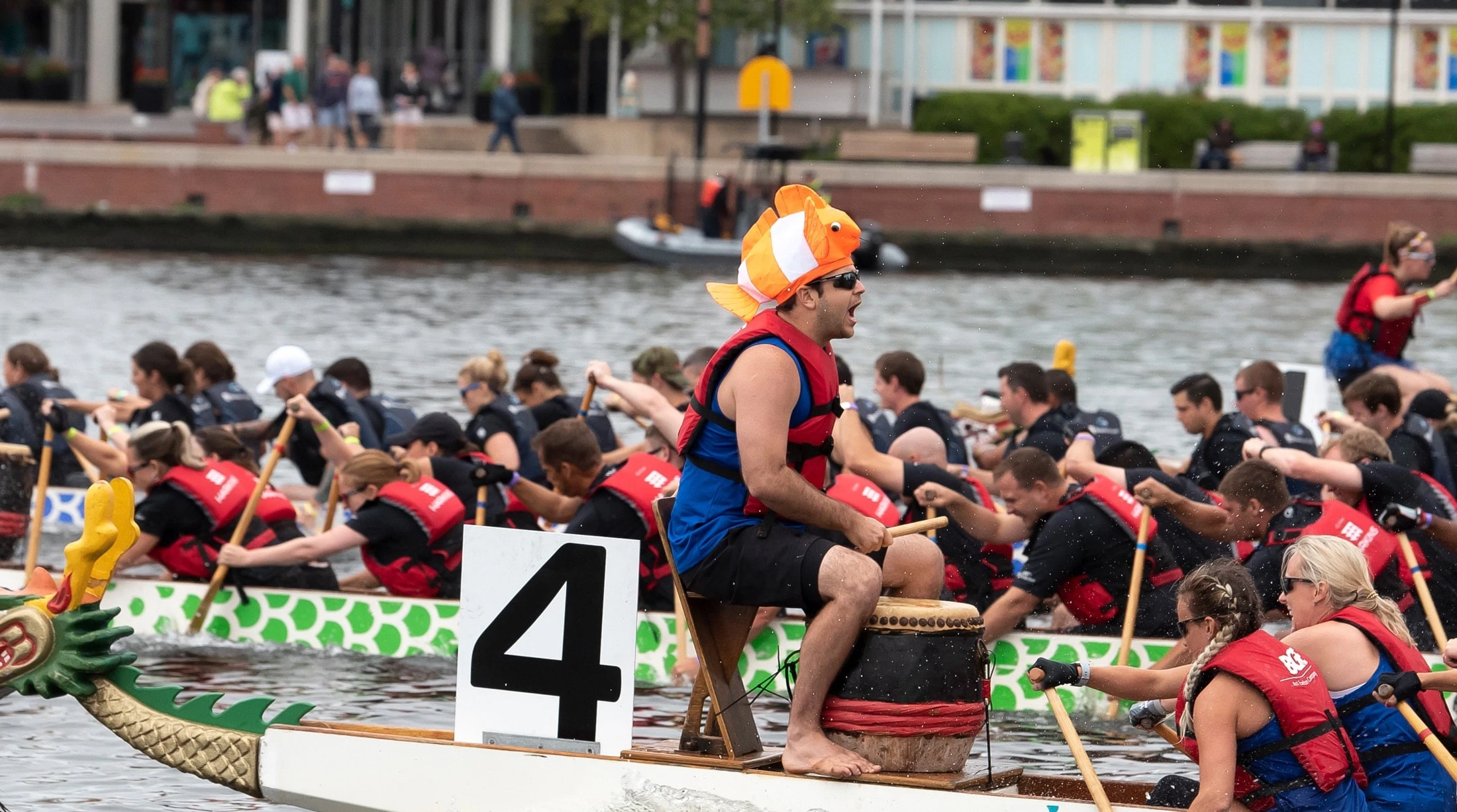
The Catholic Charities Dragonboat Races are a premier, biennial fundraising event held in Baltimore’s Inner Harbor that combine competitive dragon boat racing with community support for, and awareness of, Catholic Charities of Baltimore. The races serve as a major fundraiser to support the more than 80 programs operated by Catholic Charities of Baltimore, which provide services to 160,000+ Marylanders in need annually.
CHALLENGE
- Catholic Charities needed to reintroduce the Dragonboat Races as a must-attend Baltimore event after years of inconsistent visibility.
- The event required dual appeal: motivate businesses to register teams while attracting the broader community to attend and engage.
- Existing branding and digital presence lacked the energy, and excitement to compete for attention in a crowded event landscape.
STRATEGY
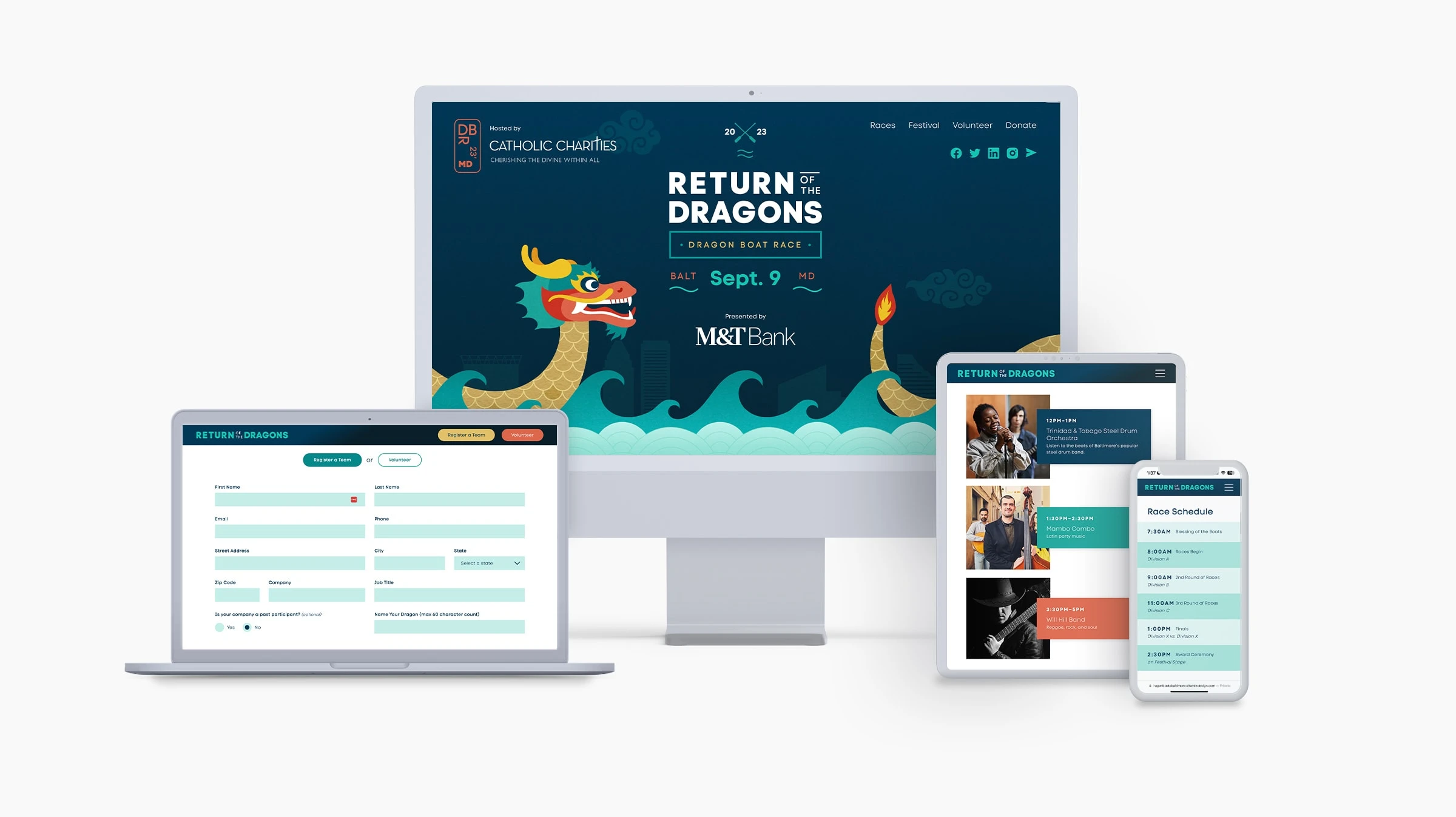
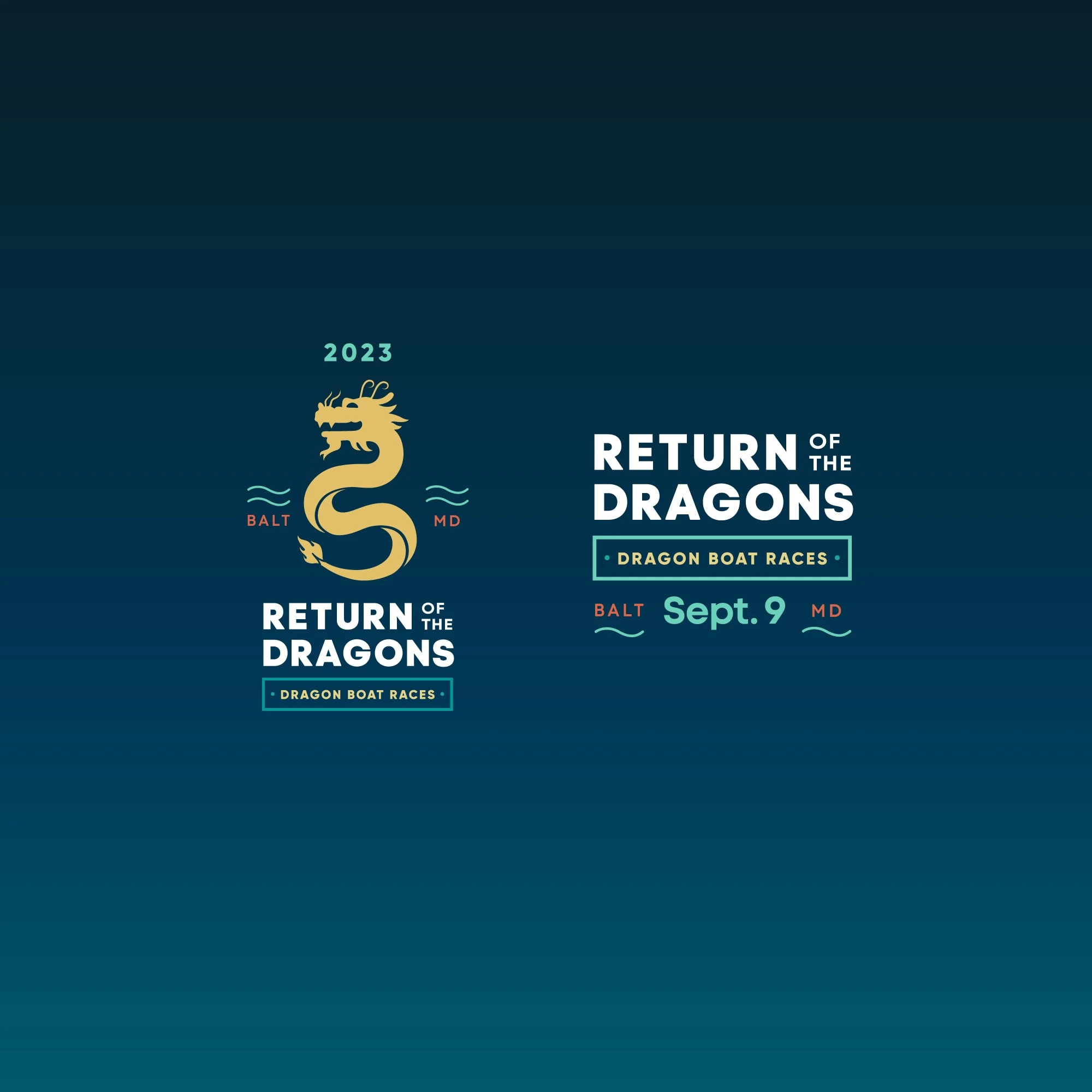
- Create a bold, energetic logo that captured the competitive spirit of the races while honoring the mission behind the event.
- Design a focused microsite that clearly communicated the value proposition for corporate teams and the excitement for spectators.
- Balance clarity and momentum, ensuring the experience inspired participation, attendance, and confidence in the event’s scale and purpose.
RESULTS
- A revitalized identity that positioned the Dragonboat Races as a high-energy, professional, yet fun community event.
- A microsite that successfully guided both business participants and attendees to take action with minimal friction.
- Renewed awareness and enthusiasm that helped elevate the event’s profile across Baltimore’s business and civic communities.
A Bold, Can’t-Miss Baltimore Experience
The revitalized Dragonboat Races brand and microsite reintroduced the event as a bold, can’t-miss Baltimore experience. A high-energy identity paired with a focused digital experience clearly spoke to both corporate teams and the broader community. The result balanced competition and mission, driving participation, attendance, and renewed civic enthusiasm around an event built for visibility, momentum, and impact.
View Site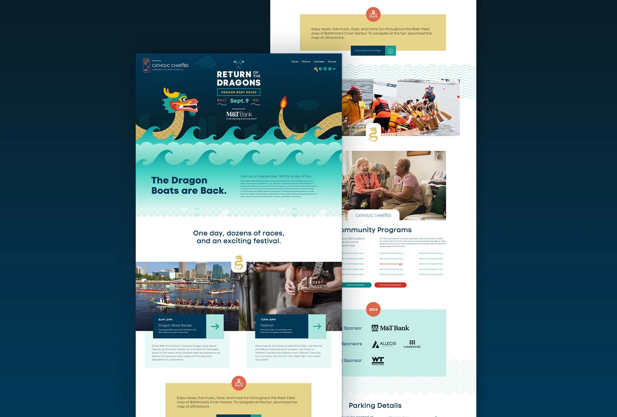
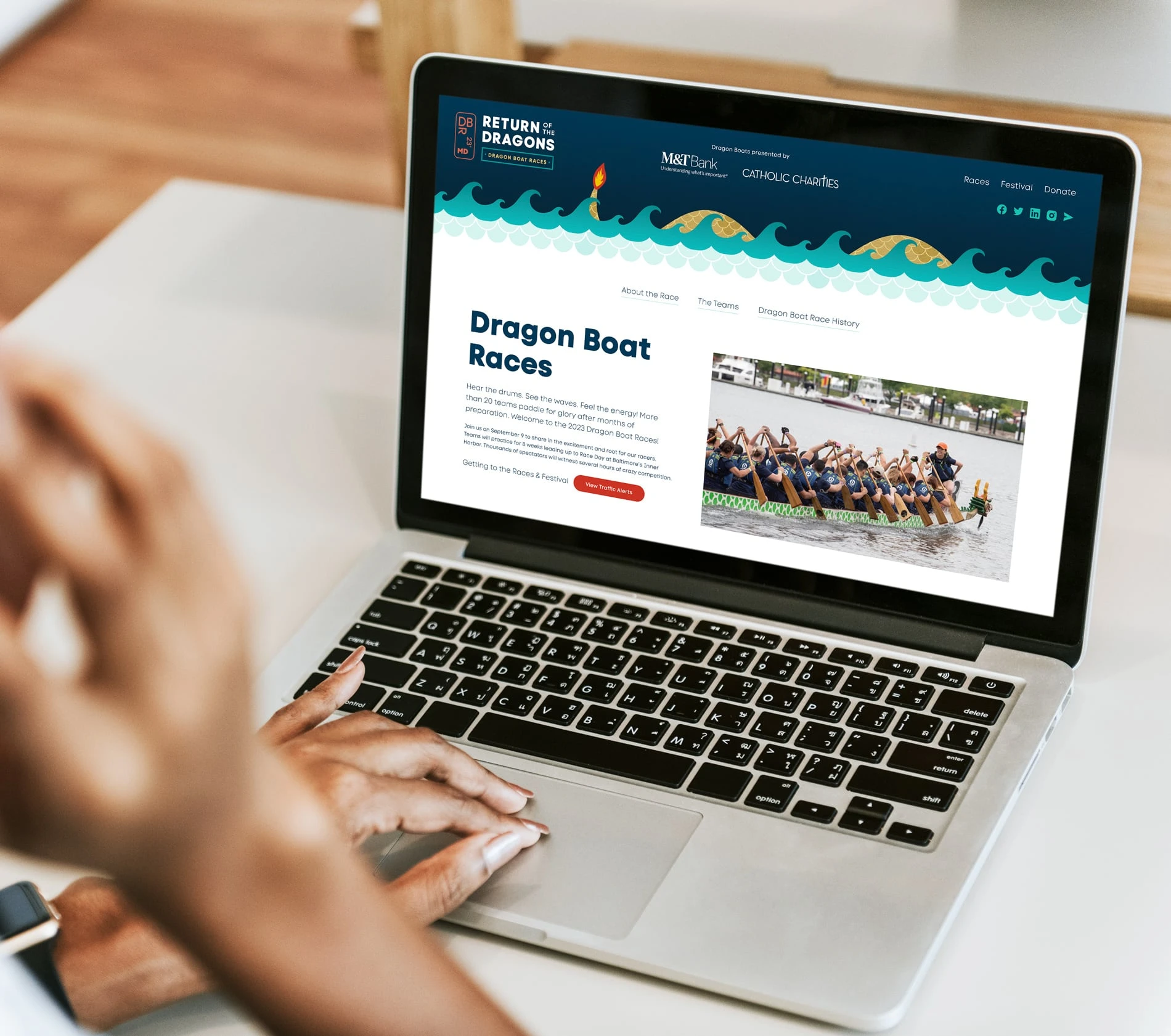
Impossible to Miss
The mobile experience was designed for immediacy, momentum and impact. Built to perform in real time, the site makes it easy to explore the event, register teams, and plan attendance on the go. Bold visuals, streamlined navigation, and clear calls to action ensure the Dragonboat Races feel accessible, energetic, and impossible to miss from any device.

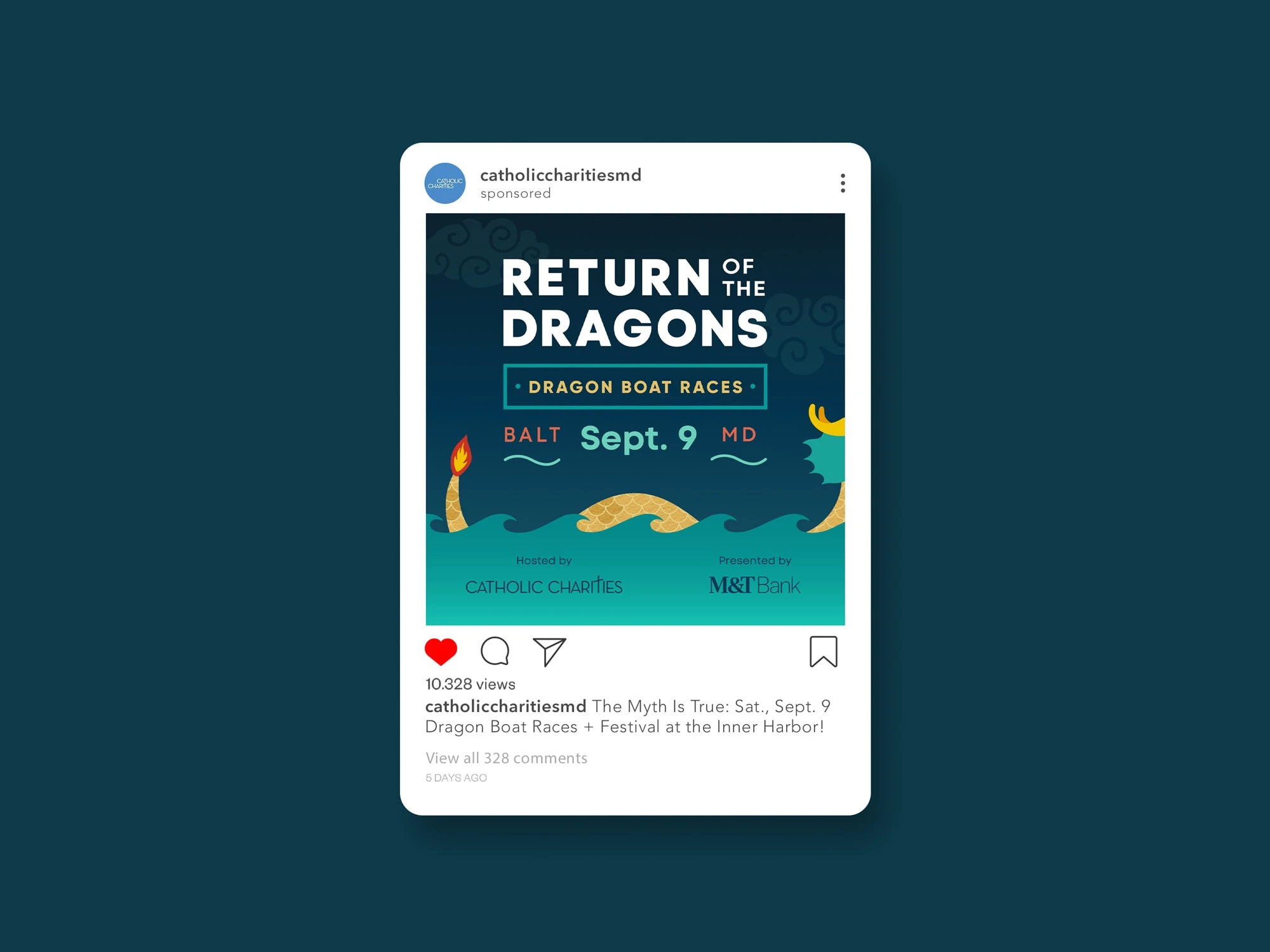

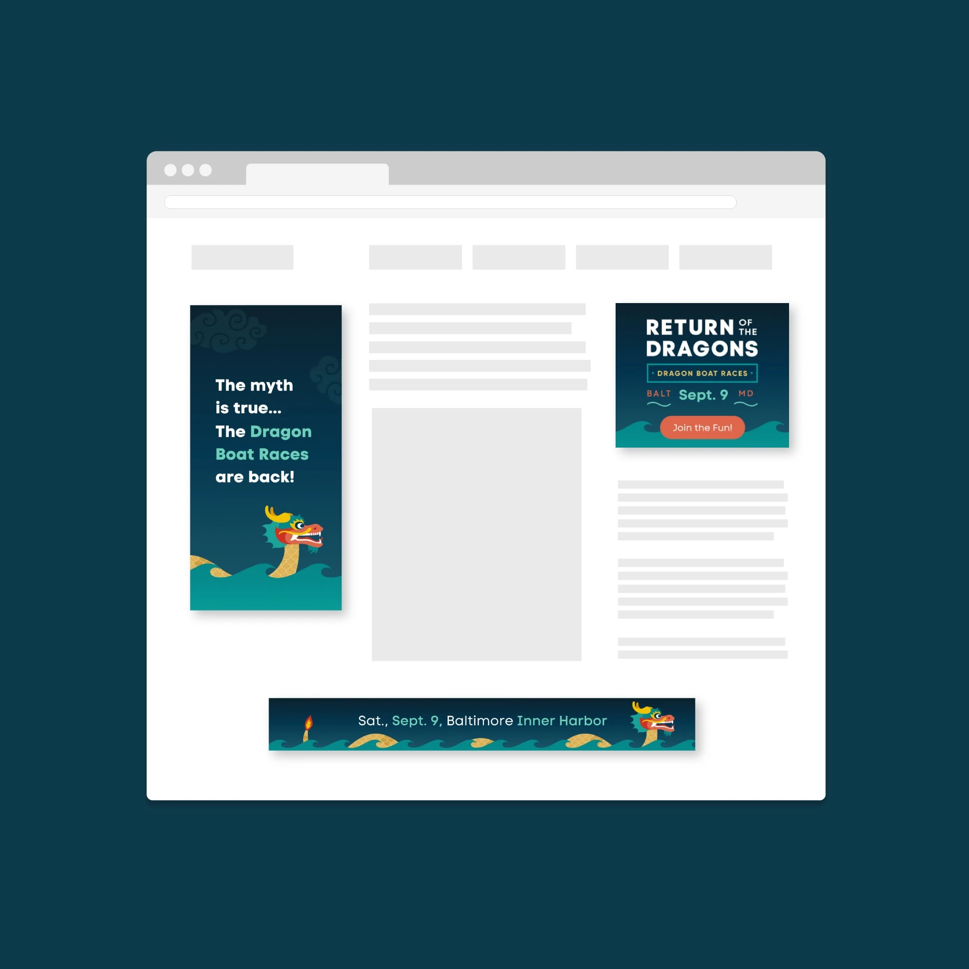
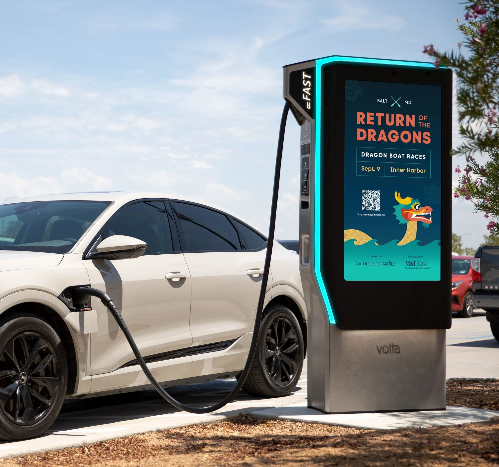
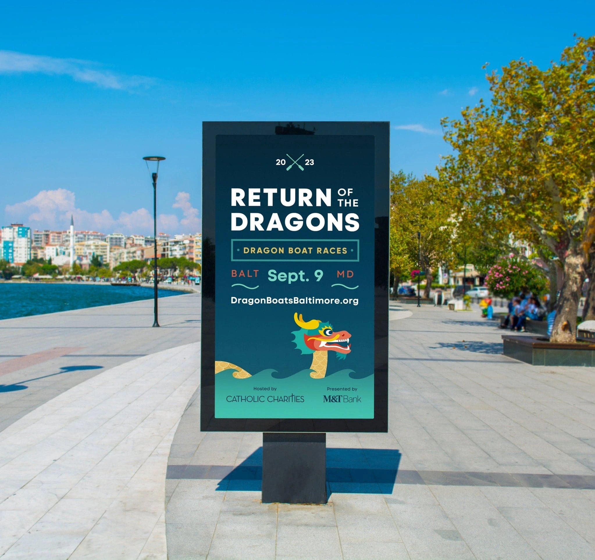
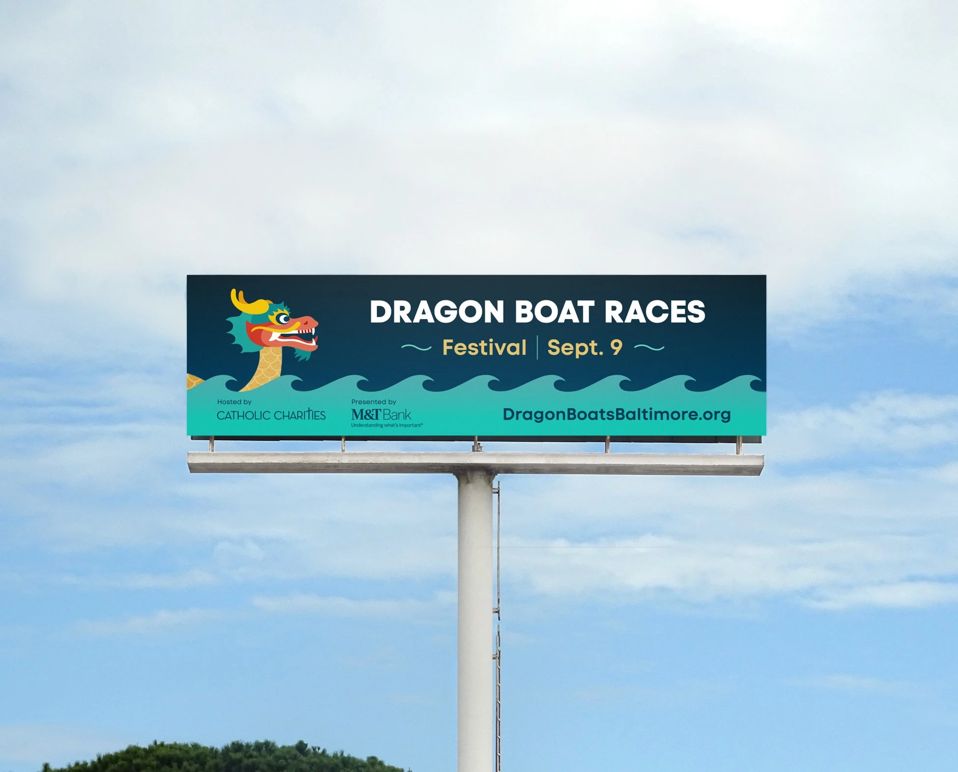
T4xt here about the campaign materials – web banners and outdoor. Volta charger, billboard, and orange barrel Baltimore harbor kiosks. Do we talk about “The Myth is true”?